When we write these posts, it is with the intention to inspire those real estate companies and agents to elevate the look and feel of their website, to make it user friendly and give the client/customer a wonderful experience while browsing your site.
From our point of view that is worth more than all the search optimization you could pay for. The wow factor results in word of mouth marketing, which is much more powerful and result driven. These are the principles we adhere to in our branding and design work
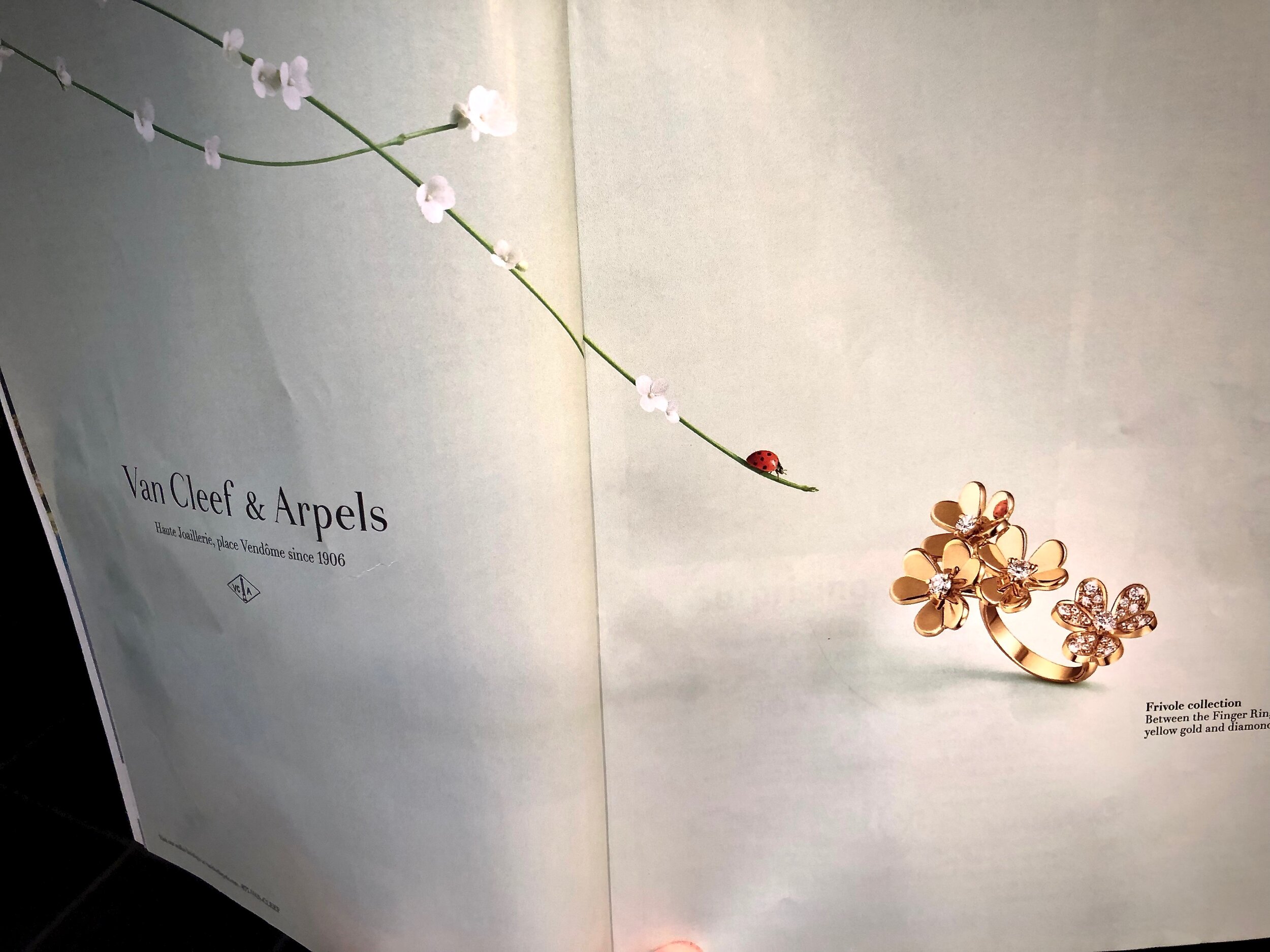
I really loved this ad Van Cleef & Arpels created for their latest ring, known as Frivole between the fingers ring! If you look closely, at the mirror polish gold, you can see the reflection of the lady bug!
Here is the description from their website, where you can see this creation up close; "Like so many flowers dancing in the breeze, the Frivole® creations by Van Cleef & Arpels stand out with their graphic and airy aesthetic. Mirror-polished gold bestows a singular radiance upon heart-shaped petals."
The ad is simple, subtle and special! If the reflection of the lady bug in the ring had not been there the ad would not have had that same impression! Details however minute completes the brand's statement of attention to detail. If you take time to peruse the website, you will notice the ease of navigation, and the clean look and feel of it.

