Viewing entries in
Branding

Branding Moment: Telling It Like It Is!

In crafting a brand, we are adamant about creating a great impression to the right audience. A first impression is what captures someones attention when looking to buy or list in real estate or in any other profession.  The message has to be clear, easy to understand, and in an nutshell, Telling It Like It Is! 

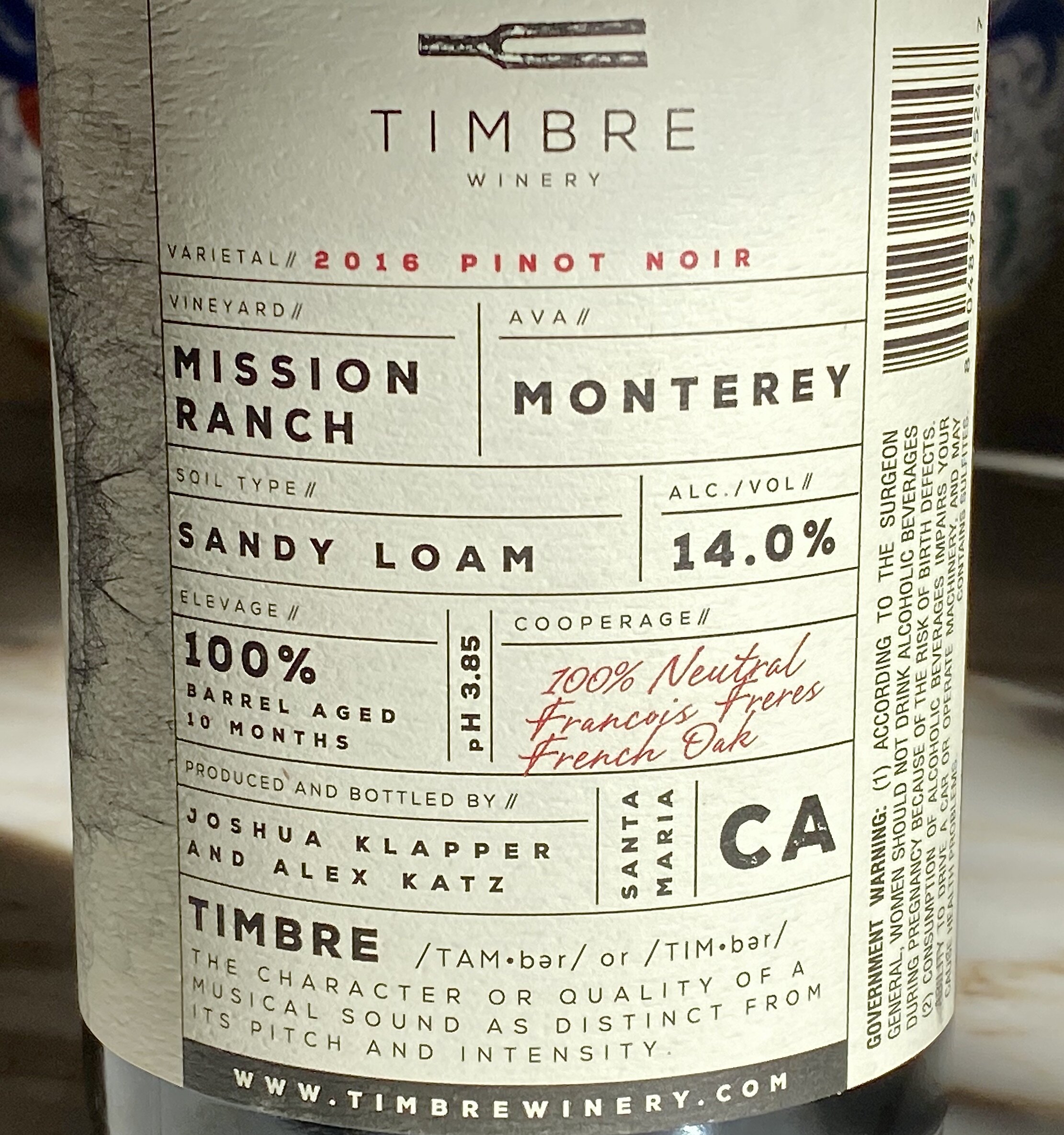
Our recent visit to see our friend Jane, owner of Carpinteria Wines, led us to trying a new Pinot Noir.  Pictured above is the back of the label.  We both appreciated that it was easy to read, and we could easily find the alcohol content instead of taking a magnifying glass to find it.   They also gave credit to the cooperage (i.e) the barrel maker. Plus, the winery took time to explain their brand name, TIMBRE!

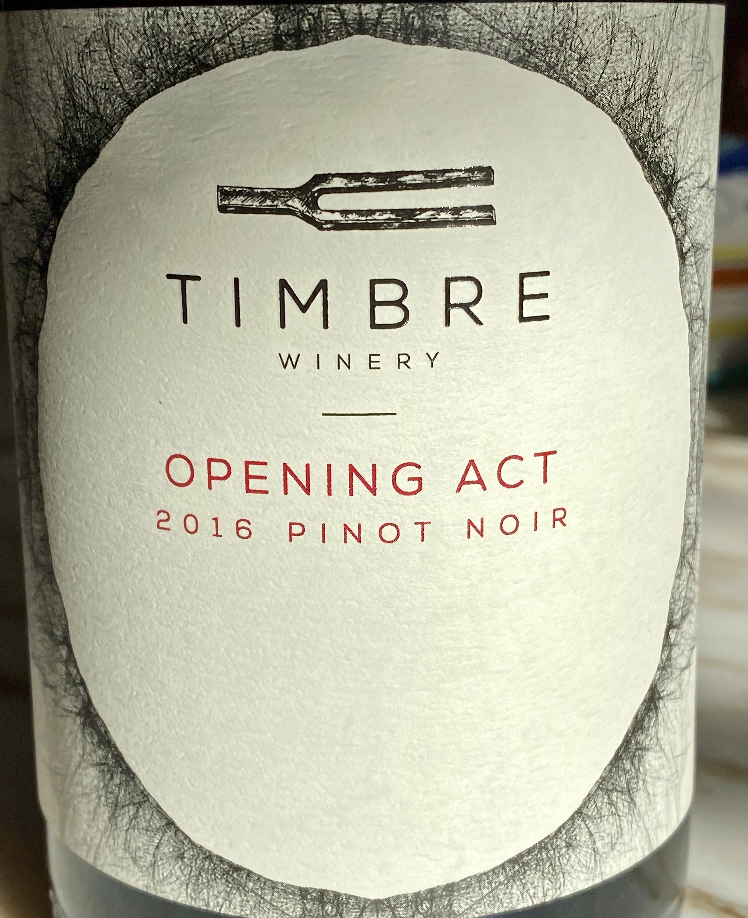
Here is the front label, and we both liked the brand name and the subtitle of Opening Act, for this Pinot Noir!  We bought it, enjoyed it, and recommend it.

Here are the winemaker's notes:

"The mix of Pinot Noir clones are co-fermented to create a wine that brims with red roses, strawberry and cranberry, but also offers cola and earthy components. The palate has a gorgeous weight and just a kiss of oak from the handful of once-used French oak barrels we slipped into the blend."

Is Your Real Estate Message Telling It like It Is?


Branding Moment: The Decision Making Process that Lead to a Yes!

In crafting a brand, we are adamant about creating a great impression to the right audience. A first impression is what captures someones attention when looking to buy or list in real estate or in any other profession.  It also applies to products and how we make decisions.  

Decisions are not necessarily made solely consciously,(stats and endorsements) but also unconsciously (the gut feeling).  Quite often if we are smart, we will take that gut feeling and honor it by perhaps delaying the decision or nixing it.  A brand that is well crafted will attract the right person to it. Here is an analysis of a simple buy.

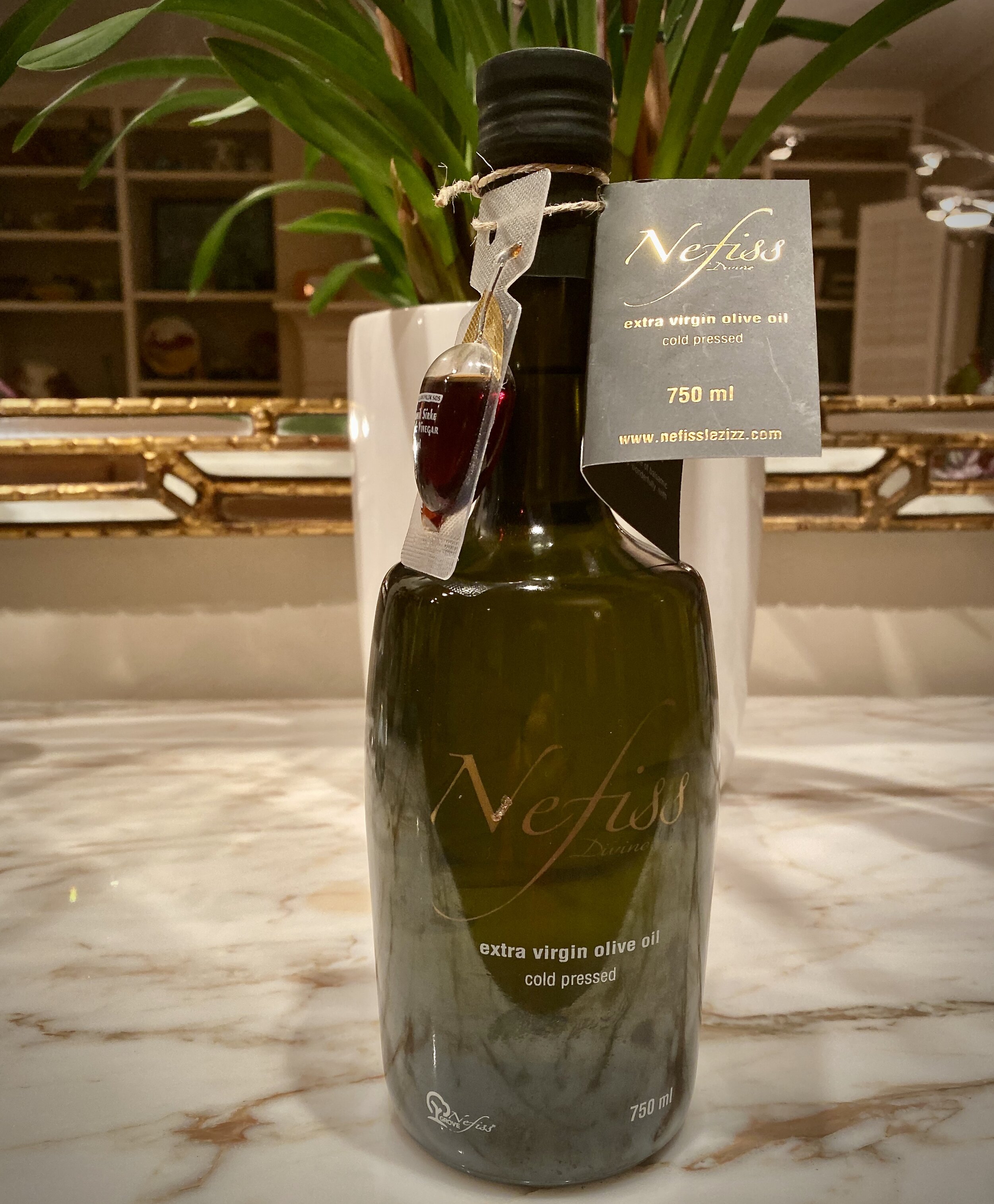
Pictured above is bottle of olive oil from a Turkish producer named Nefiss. This is how it ended up in my pantry. 

I am always interested in learning more, and to that day I had not tasted Turkish olive oil. I usually favor Italian or California olive oil.

I was attracted to it based on the design of the bottle, (attention to details).  

I read the little card attached to it describing the family and their story of the care and age of their olive trees in Turkey, (I like supporting family enterprises).

I was impressed that there was a sample of their balsamic vinegar on the bottle in the same shape as the bottle, (congruity in design and a sign of a generous spirit).

I found it in the take out store of Industrial Eats in Buellton, California.  We both admire the owners who are even more finicky than we are, when it comes to excellent products for their restaurant, and the products they sell...They became a subtle endorser brand.  In other words,  I trusted their judgment. 

Even, if I did not like or use olive oil, I would have bought it for a friend who does, based on my impressions. We all have an abundance of dominant impressions that guide our decision making.  When I ask people what led them to hiring someone, they come up with many of the thoughts I mentioned, and others that govern their decision making.  Quite often, the gut rules, because it is the least biased impression!

Have you ever analyzed your decision making process?

Branding Moment: Just One Glance, That's All it Took!

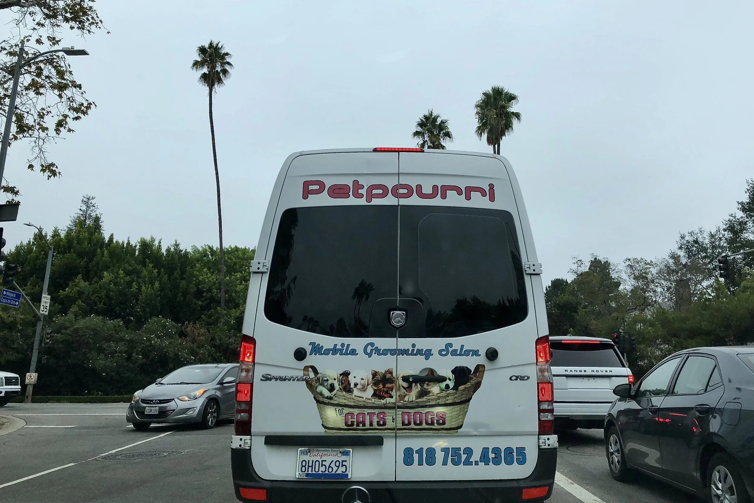
Unlike the brand I discussed on Tuesday, in our Branding moment, this one took just one glance, just one nanosecond to figure what this company does, a mobile grooming salon. I liked the brand name, "Petpourri" a take off on the word "potpourri: A mixture of dried petals and spices placed in a bowl to perfume a room. In this case, they cater to cats and dogs, clearly stated. And, the phone number is easy to read!

When we write these posts, it is with the intention to inspire those real estate companies and agents to elevate the look and feel of their website, to make it user friendly and give the client/customer a wonderful experience while browsing your site. This is our goal with every client/company we work with.

Branding Moment: It took 30 minutes to Understand this Brand!

When we write these posts, it is with the intention to inspire those real estate companies and agents to elevate the look and feel of their website, to make it user friendly and give the client/customer a wonderful experience while browsing your site.  
Once again we were stumped by this brand, and what their slogan meant (pictured above). And below is the brand logo.

It took me 30 minutes to figure this out, and I had to visit several sites to gain  an understanding. Finally, I found their site.  The site's first offerings are Tshirts with their logo and slogans. Below are beer pack of offerings.  

By surfing links, I was able to find their unique reason for existence.  The beer featured on this truck is described as:" Cashmere hops are joined by their juicy tropical aromas of citrus, pineapple and coconut.." It is one of their sub-brands of the Stone beers company.

Bottom line, think of the client's experience, when seeing your website.  Keep it simple, keep it clear and easy, do not make them guess!  Most people would have given up after the first manifestation of their social page...I would have!

Branding Moment: Simple, Subtle and Special--The Wow Factor!

When we write these posts, it is with the intention to inspire those real estate companies and agents to elevate the look and feel of their website, to make it user friendly and give the client/customer a wonderful experience while browsing your site.  

From our point of view that is worth more than all the  search optimization you could pay for. The wow factor results in word of mouth marketing, which is much more powerful and result driven. These are the principles we adhere to in our branding and design work

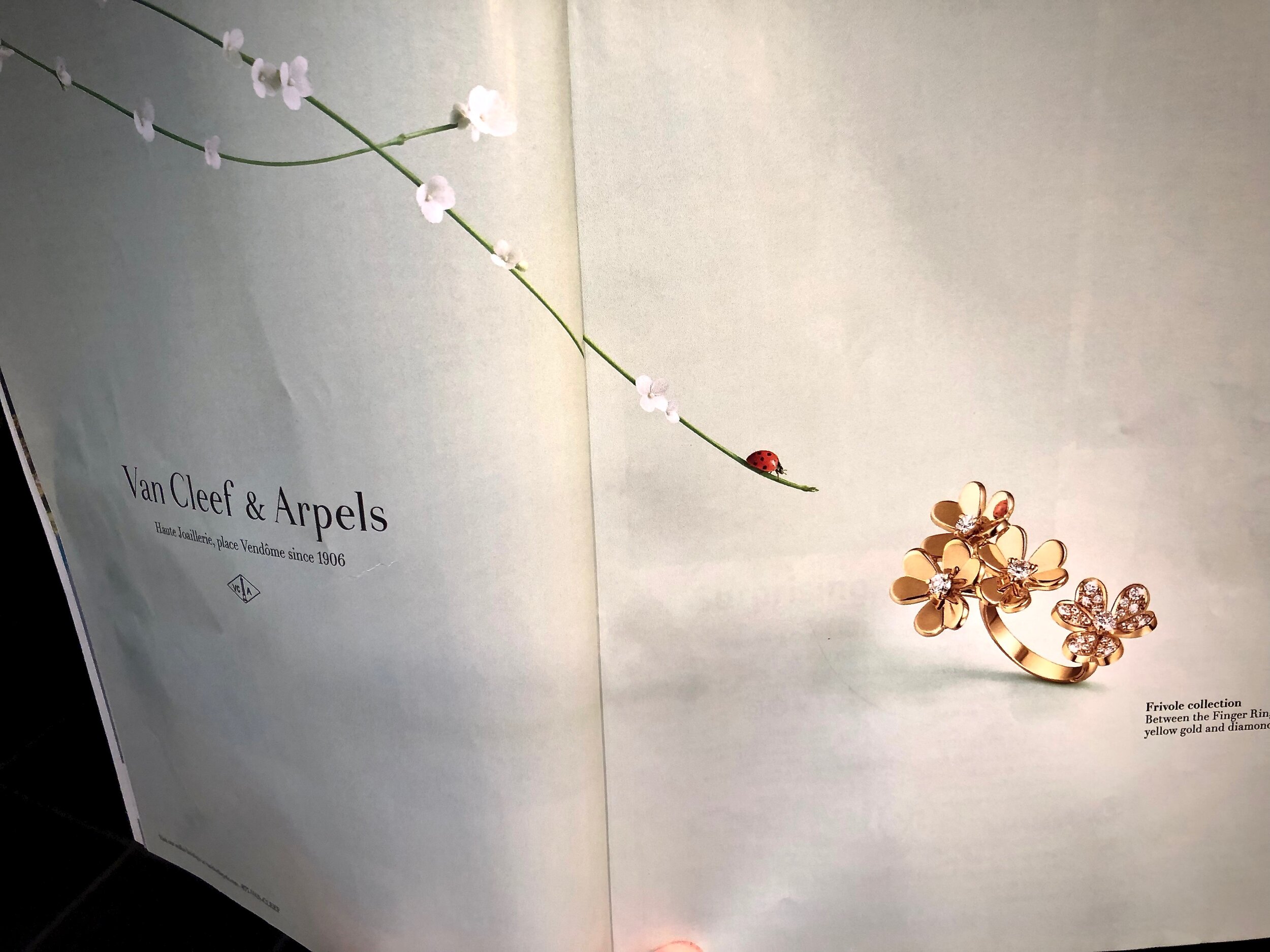
I really loved this ad Van Cleef & Arpels created for their latest ring, known as Frivole between the fingers ring!  If you look closely, at the mirror polish gold, you can see the reflection of the lady bug!  

Here is the description from their website, where you can see this creation up close; "Like so many flowers dancing in the breeze, the Frivole® creations by Van Cleef & Arpels stand out with their graphic and airy aesthetic. Mirror-polished gold bestows a singular radiance upon heart-shaped petals." 

The ad is simple, subtle and special!  If the reflection of the lady bug in the ring had not been there the ad would not have had that same impression! Details however minute completes the brand's statement of attention to detail.  If you take time to peruse the website, you will notice the ease of navigation, and the clean look and feel of it.  

Is Your Real Estate Practice a Work of Art?


The late great Steve Jobs believed that, like works of art, Apple computer chips should be signed by those who created them. While few customers ever saw the signed chips, the creators had a tremendous sense of pride about their work. If your real estate practice was a product would you sign it? Is it a work of art?

Recently, we enjoyed a pizza at one of our favorite restaurants, Industrial Eats, which is located about one hour up the coast from Santa Barbara, in the wine country It is worth the trip because the pizza there is the closest we have found to the best pizza in Italy. 

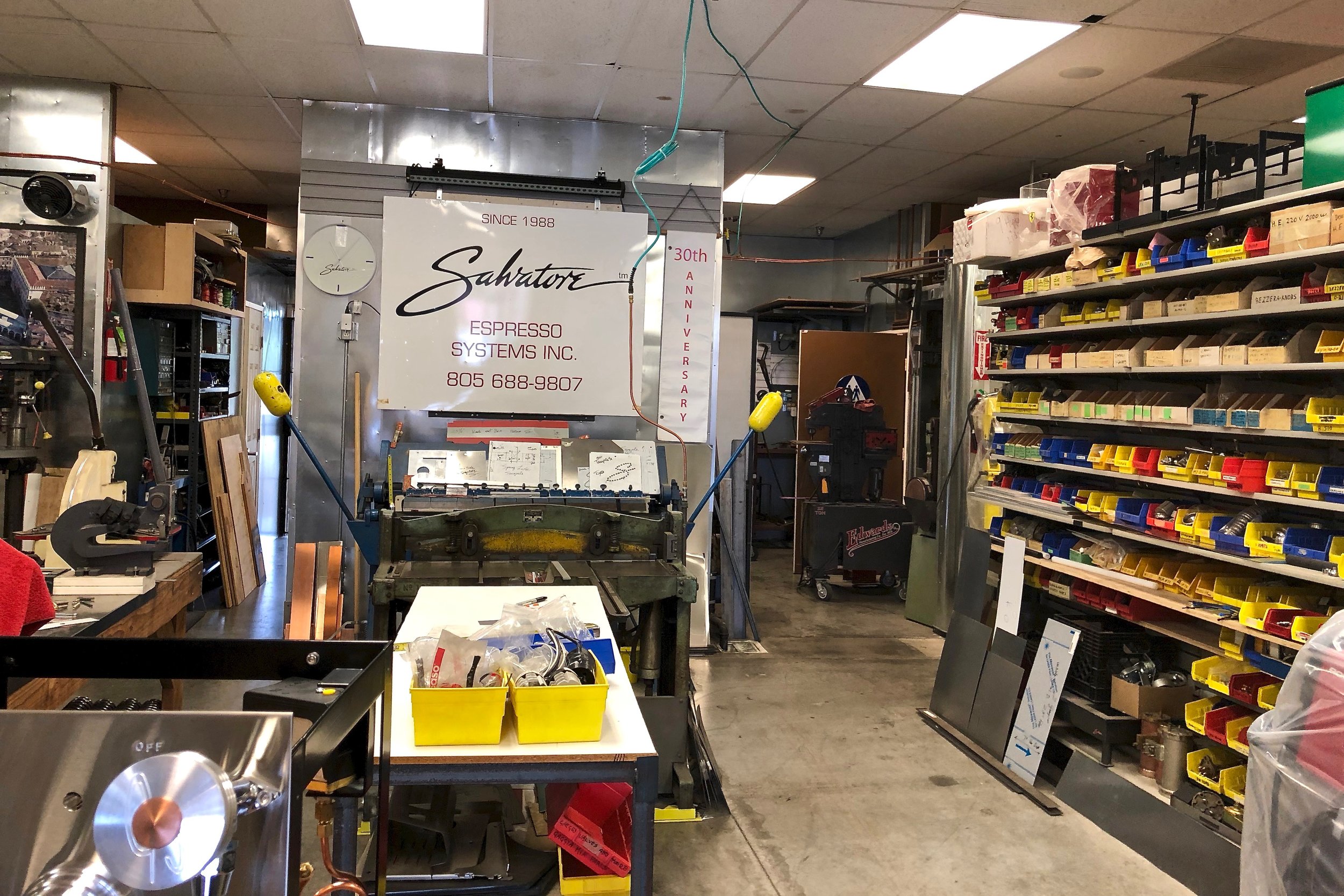
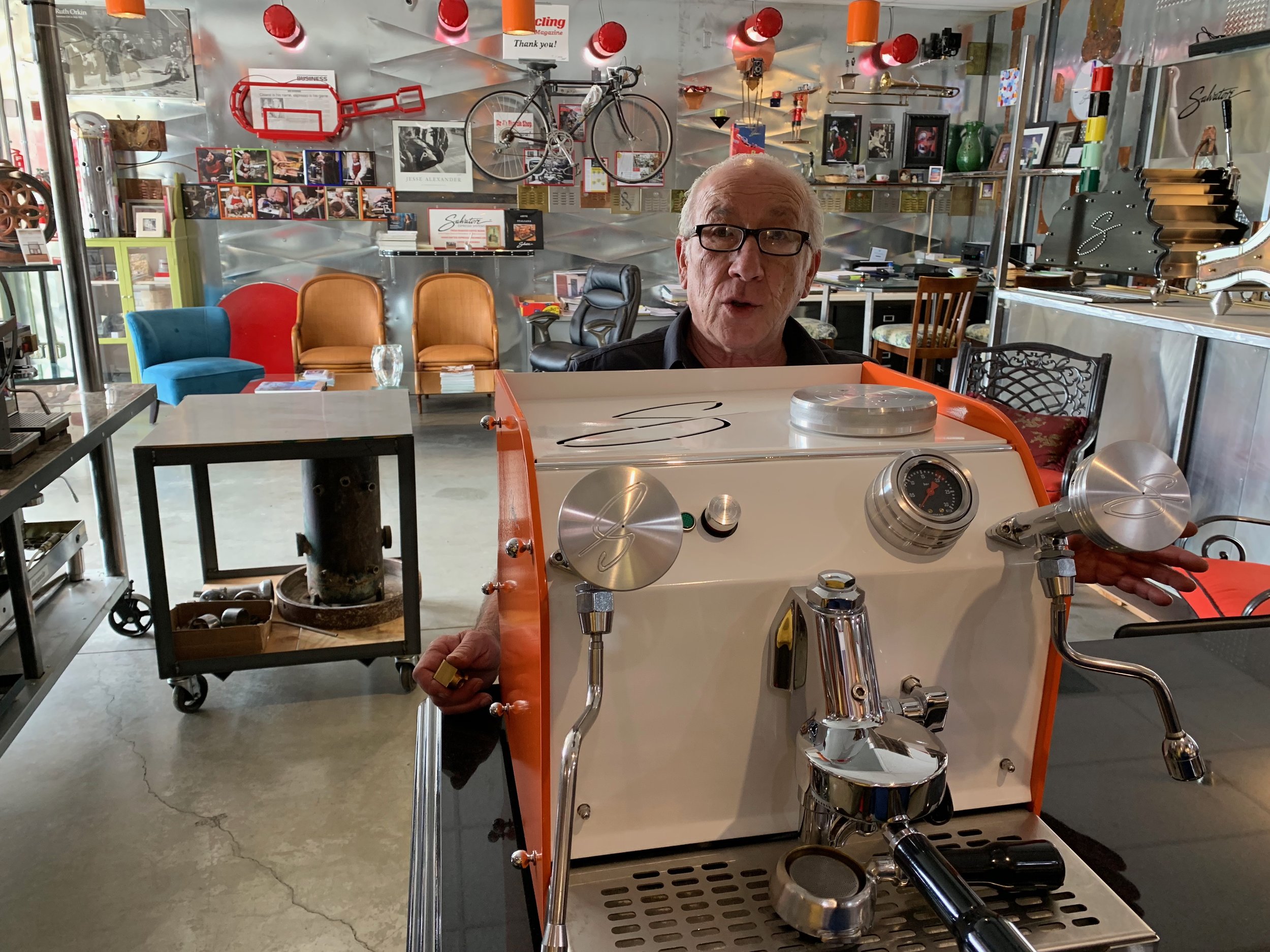
Before heading home, we each ordered espressos. After one sip we looked at each other with the exact same thought in mind: this was the best espresso we had tasted in he USA!  We looked for the server to ask if we could purchase some coffee to take home. She was at the massive espresso machine that looked like it was custom designed, imported from Italy and signed by the manufacturer, Salvatore.

Once we got her attention she told us that Salvatore is a local Italian craftsman who both restores and creates custom-built espresso machines for restaurants and home use by coffee connoisseurs. He also sources the coffee, composed of three kinds of beans, that he has roasted per his exacting standards.  It is called Tri Colore (like the three colors of the Italian flag-green white and red). 

The next week we drove up the coast again just to meet Salvatore and his lovely wife Wendy who welcomed us with open arms, literally! They enchanted us with stories about Italy. And they showed us around their showroom/workshop while we sipped on espressos that Wendy artfully made for us.  We learned that they lived in our favorite Italian town of Florence where Salvatore made buckles and other metal elements for handbags and shoes for luxury goods companies like Ferragamo.

We wondered, in our age of automation and Artificial Intelligence, if Salvatore is the last of a dying breed of fine craftsmen who see their work as art, worthy of their personal signature. Or, were we witnessing the beginning of a new trend, spurred on by people seeking refuge from too much time in front of digital screens? 

Salvatore informed us that many of his customers are creating “coffee rooms” vs. “media rooms” that are more conducive to the art of conversation. Salvatore’s spectacular custom-designed espresso machines and delicious coffee are certainly conversation pieces. They tell a great story that resonates with those of us who truly appreciate, signature-worthy fine craftsmanship.

Is your real estate practice a signature-worthy work of art? 

Branding Moment: A Touch of Drama Is Memorable!

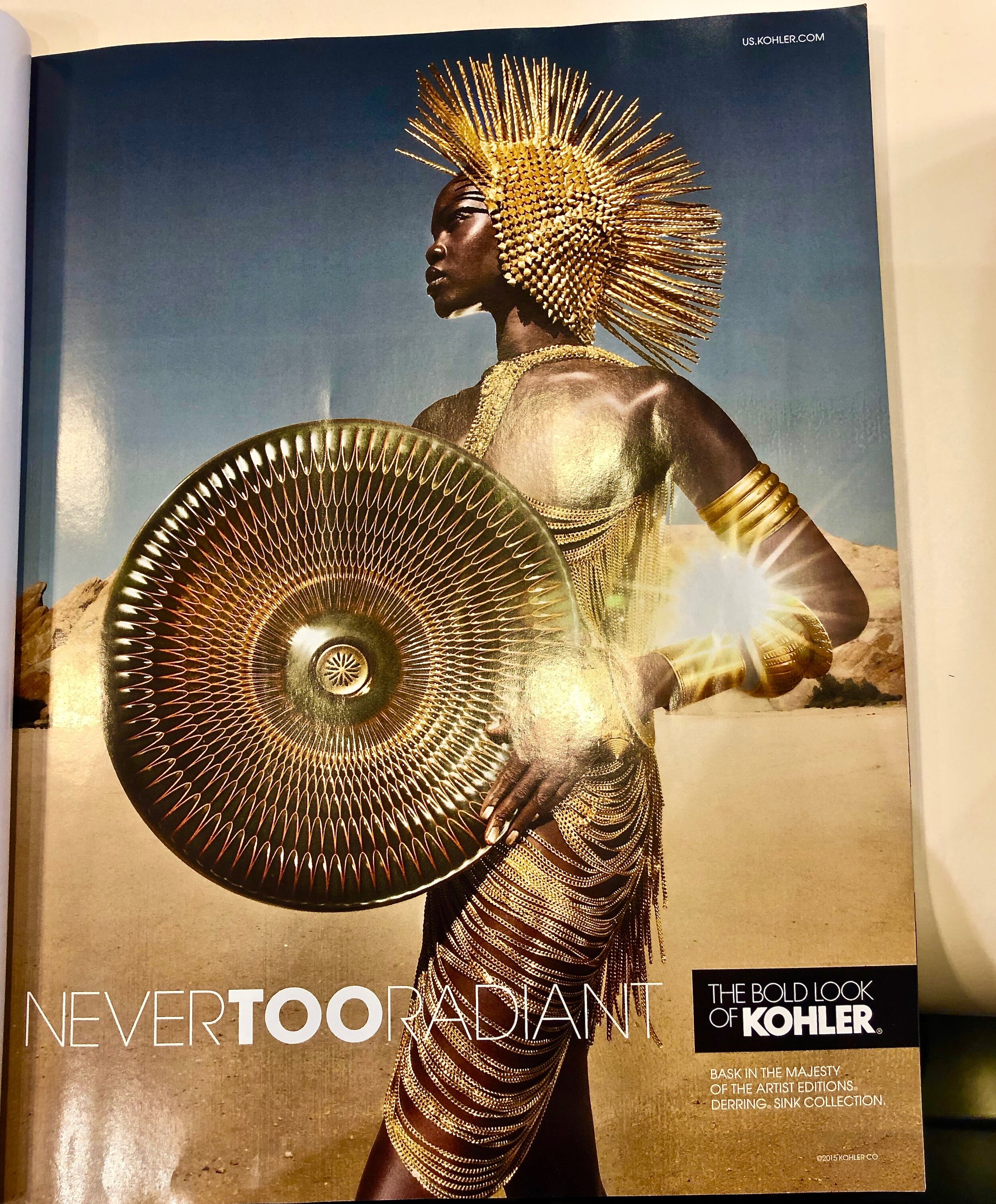
We enjoyed the creativity of this print ad in one of the current issues of Architectural Digest promoting their artist editions of sinks by Kohler.  And we appreciated the dramatic setting, the beauty of the model-and her costume.  A touch of a dramatic flair done right makes this ad memorable!

The sink is made of white porcelain and covered with a special glazing method which was inspired by master potters.  We have included a link, so that you can see it up close on the Kohler site.

We are firm believers that great real estate home photos should have a dramatic flair to attract potential buyers.  For instance, one of our clients here in Santa Barbara, started the photos of the home on his site of his recent listing with a picture of the outdoor patio— the fire pit lit, overlooking the ocean at sunset.  

That was the very picture the buyers fell in love with, and subsequently purchased the home!  They saw themselves sitting there with a glass of wine! That memorable touch of drama turned into the sale of this home!

Branding Moment: No Guessing--Clear Messaging!

Communicating clearly and succinctly as to what you do in real estate or any other profession on whatever medium works for you is essential when promoting yourself, in a brochure, on line, on the web or on the road as this truck pictured above does.

 In our previous post, we shared an image of a truck with a confusing message. The image of the truck above kept us guessing. SB AV (Santa Barbara Audio Video did not assume that those reading knew what AV meant. Then, they listed their services... We would definitely call them or suggest to someone their service based on the clarity of their message!

There is a big difference between clarity and obfuscation (def as the action of making something obscure, unclear, or unintelligible)!

Branding Moment: A Name Out of Context?

In the last few years, there has been an explosion of craft beers on the market.  The branding of these beers have been creative and the visuals beautiful in many instances. Pictured above in one form of naming a product or service.  This is known as using a word out of context to the product.  

The word "mischief" is defined as; playful misbehavior or troublemaking, especially in children.  However, this is not a children's product, as the law requires that one is of legal age to buy or drink the beer. The accompanying colorful image is also out of context.

What is your impression? Do you like the name? The graphics? Would you be moved to buy, if you were a beer fan, or buying for someone who is? 

Branding Moment: The Intention Is Good, & the Message Confusing!

The whole intent of luxury real estate branding and marketing is to have a clear cut message. In order to have the desired impact this message should be easily understood. This is the primary way to achieve visibility and recognition in your market place.

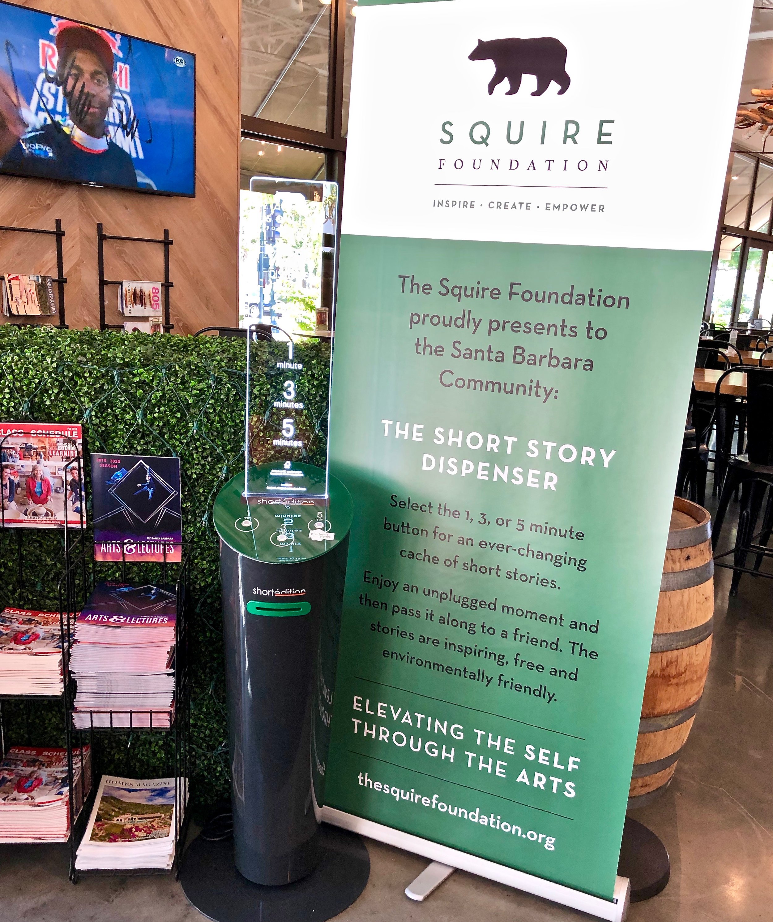
Pictured above is a kiosk and a plexiglas sign from the Squire Foundation. This is located near the entry door to the Santa Barbara Public Market which is a large warehouse one story building that is home to various restaurants and a wine bar. It caught our attention, as did the claim that this was an unplugged moment to enjoy.  We found it ironic that the whole thing faced the sports bar/restaurant with 10 big screen TV's covering the sporting events around the world.

I chose a 3 minute short story.  I know that my high school English teacher would have labeled it as "purple prose".  It means,  "text that is so extravagant, ornate, or flowery as to break the flow and draw excessive attention to itself."  And I did not get the story at all.

Then, I asked the guys at the wine bar about this story/telling machine.  They told me that it has been there for three months, and it came from somewhere in England. They have tried the stories and thought, they were "just OK".  Clearly they were underwhelmed by the whole idea. That brought to mind a quote by George Bernard Shaw commenting on the fact that the British had a hard time understanding American English and vice versa:, "The United States and Great Britain are two countries separated by a common language."

Given that I was going to write a blog about this, I went on line and discovered that the foundation was located in Santa Barbara and not in England.  Here is their mission statement, "the Squire Foundation is a non-profit empowerment foundation, dedicated to civic and educational programs for artist, curators and all manner of creative people."

As I watched people filing in for lunch, no one looked at the kiosk or helped themselves to even a one minute story.  They were focused on that TV screen....It brought to mind another quote," the road to hell is paved with good intentions."

Branding Moment: Analysis of a Real Estate Brand Personality

On our travels through Santa Barbara, we often see this ad on the back of our buses, for this local real estate firm. This is what we refer to as "brand personality."  By expressing on their ad, that their real estate agents are attorney trained,  they have positioned themselves as having competence

competence personalityis defined as:
Reliable:hardworking, secure efficient trustworthy, careful, intelligent and successful.
Intelligenttechnical, corporate, serious.
Successfulleader, confident, influential.

In the corporate world, IBM as an example of a brand with a competence personality. Like IBM,(aka Big Blue), this brand uses Blue as its  primary brand color.  The expression "true blue" means dependable, reliable, stable, and the shade of blue is generally associated with these characteristics.

Keep in mind, that this real estate company’s unique promise of value is that they are owned by a practicing real estate attorney.  The brand personality is a subset of the unique promise of value, and is part of the overall brand identity, as is the color choice.

This brand will attract those who can identify with its personality, because it is a reflection of how they see themselves.  Remember, people like to do business with people like themselves.

Do you know your brand personality?

Branding Colors: Can You Hear The Sound of Color?

We are always fascinated by color combinations can work together and catch our attention.  We both have often remarked that certain colors speak to us.  And in our real estate related branding work we research the colors that our clients like that speak to them.   

As we delve into working with color combinations, we will ask our clients: "does this speak to you?"  It has to resonate, or as defined in the dictionary to relate harmoniously to that client or company.

Recently I read a book about people who actually hear in colors.  This is called synesthesia.  Not all those individuals are necessarily musicians, some are artists, and some are not.

People with synesthesia related to music may also have perfect pitch because their ability to see/hear colors aids them in identifying notes or keys. The colors triggered by certain sounds, and any other synesthetic visual experiences, are referred to as photisms. (Wiki)

Wassily Kandinski, a Russian artist, was known for his abstract paintings and the use of bright colors as pictured above in this photo of the Church of St Ursula (public domain photo).

Although he was not a musician, he talked about the sound of color.

"The sound of colors is so definite that it would be hard to find anyone who would express bright yellow with base note, or a dark lake with the treble."

"Color is the keyboard, the eyes are the harmonies, the soul is the piano with many strings. The artist is the hand that plays, touching one key or another, to cause vibrations in the soul."

And here is my favorite quote,

"Lend your ears to music, open your eyes to painting, and... stop thinking! Just ask yourself whether the work has enabled you to 'walk about' into a hitherto unknown world. If the answer is yes, what more do you want?"

Can you hear the sound of color?

Branding Moment: The Unique Value Proposition Hooked Us In!

We rarely follow guidebooks when choosing a restaurant when we travel.  Most of the time, we will ask a local, or our hotel concierge, or we more often than not, we let our intuition or branding nose guide us.

After several hours of walking in Paris, it was lunch time.  We walked into Lavinia, a wine store just to explore.  As we looked up, we noticed they had a restaurant, on the second floor. (pictured above) When we got up there, the host told us they had great food, and showed us the menu which we liked. 


As I (A) looked up I saw this sign on a blackboard pictured above.  Translation: We serve all our wines at the store price.  In other words, unlike other restaurants, there is no markup on their retail price. And there it was their unique value proposition which hooked us in.  And you can also see that same statement on their red wall in the restaurant.

Here is the unique value proposition defined:
Also known as a uniqueselling proposition(USP), your UVPis a clear statement that describes the benefit of your offer, how you solve your customer's needs and what distinguishes you from the competition.

Of all the restaurants we have eaten in globally, nationally and locally, this was a first. Some had a wine store as part of their premises and they had the usual mark-up. 

By the way, our lunch was delicious as promised as were the wines our waiter suggested. We were so glad we arrived early, because within 10 minutes of us sitting down, the place was full with the local business people.  Next time we are in Paris, we look forward to having another meal there. 

Will your unique value proposition hook your market in to do business with you?

Branding Moment: Not so Puritan Taboo Slogan near Hot Springs Rd!

Ron and I spotted this truck from Puritan Bakery with its slightly racy slogan of "Best Buns In Town". The word "puritan" means: one who practices or preaches a more rigorous or professedly purer moral code than that which prevails.  The slogan can be interpreted in so many ways. We leave that to your imagination. 

The juxtaposition of the truck with the exit of Hot Springs Road was a moment of synchronicity.  We were wondering if they were going to take the Hot Springs Exit to deliver best buns to the Von's grocery store there...They did not!

According the their website, which has an image of a man in a Puritan costume and slogan, this is the secret to what makes best buns:

Puritan Bakery is committed to baking our bunsand breads the old fashioned way -- the way you would if you were making bread from scratch at home. Because of this commitment, we still use a sponge and dough process, rather than the faster and cheaper brew dough, straight dough or modified sponge systems. The sponge and dough process takes 7 hours, but we believe that the best things are still worth waiting for.

This brand caught our attention and gave us a chuckle.  We will remember the name, no doubt about that.  The bakery started in 1930, and they are still going strong. The right market is still buying.Just like in Real Estate, there are many brands and markets for each one as long it lasts.

We would definitely mention them if someone asked us what kind of hamburger or hot dog buns to buy. Their baking method is impressive.

However, we are not their customer.  If we are going to indulge in bread of any kind, we would buy artisan bread made locally.  

Branding Moments: The Importance of Heritage vs High Tech Auto Pilot!

In branding a company or an individual in luxury real estate or in any other real estate field, the concept of heritage is an asset and a  great differentiator. Brand heritage (something handed from the past: experience or a way of doing business). There is plenty of merit is high touch (incorporating the old fashioned) versus high tech (auto pilot) real estate.  

This can inspire confidence when a consumer is making a choice of which agency or agent to pick when buying or selling a home.  It can also imply great service or what is often referred to as high human touch or white glove service. Here is an example of a trend we have noticed in wine-making that is applicable in real estate.

In the world of wine production, which is even more competitive that the world of real estate, we are noticing heritage as a differentiator. Pictured above in the window of a wine store in Paris is the lePuywine brand.  They have been in existence since 1610.  Their slogan "authenticity reflected in their terroir, (terroir is the composition of the soil that gives the wine its unique flavor)."  

The authenticity is the illustration of the horse and the plow, which means that their wines are produced bio dynamically. They are still using horses to plow the soil around the vines, because horses are lighter than tractors and do not damage the vine roots.  They also use natural fertilizers, as they did in the old days of wine making, which contributes to the health of the vineyard.

More wine producers are reverting to bio-dynamics.  "In a blind tasting of 10 pairs of bio-dynamic and conventionally made wines, conducted by Fortune Magazine and judged by seven wine experts including a Master of Wine and head sommeliers (wine stewards), nine of the bio-dynamic wines were judged superior to their conventional counterpart. The bio-dynamic wines "were found to have better expressions of terroir, the way in which a wine can represent its specific place of origin in its aroma, flavor, and texture."(Wikipedia)

We have often preached the importance of high touch in all real estate whether it is luxury or industrial real estate.  Not a day goes by when a new technology is offered to bypass the human touch, essentially being on auto pilot as the end all be all.  The clients and companies we work with are known  and praised for their impeccable customer service which software will never replace.  


Branding Moments: Is This a Case of Brand Identity Crisis?

In branding, it is of paramount importance to define who you are as a real estate agent, or company, what you do, as well as who your intended target market is.  A brand identity becomes the core foundation of your strategy and marketing.  

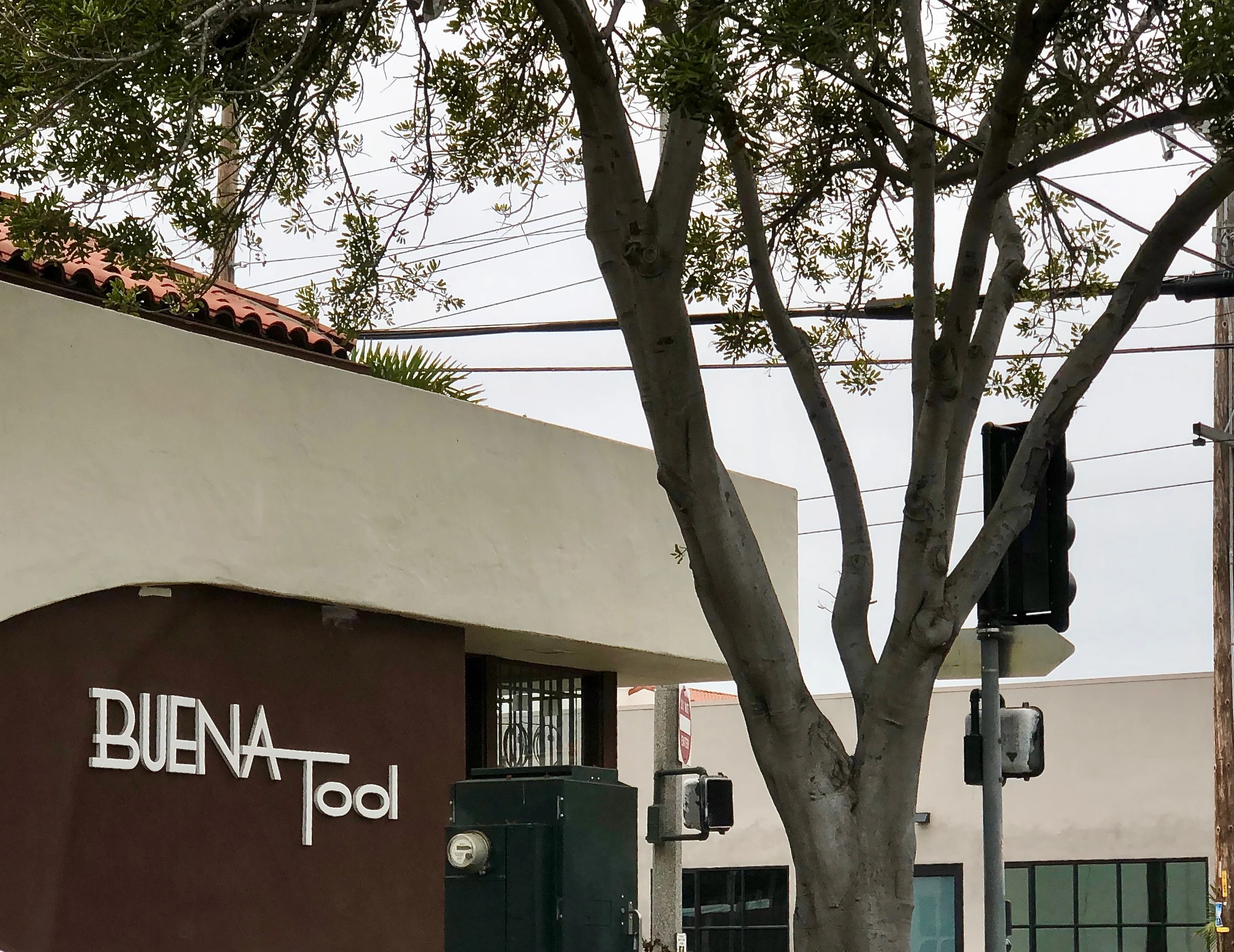
Pictured above is a building that we drive by frequently.  Clearly based on the description, we are not their target market.  We have plenty of tools we may need, and if we needed something in the tool world, we would stop at Ace Hardware, which is around the corner...

Recently, we noticed a new bright yellow banner sign on the back of the building.  It reads, "We Are Not Just A Tool Store".  So what are they besides a tool store!  This sign adds to the confusion. No explanation is given?   

Is this a case of brand identity crisis?

Branding Moments: Do Your Brand Colors Reflect Your Marketplace?

The colors of a brand are part of its identity.  It is the first thing, people notice.  Colors are impressions and they are associated with feelings, impressions and experiences, that the onlooker identifies with or does not.  Pictured above is a scene from Carpinteria State Beach at low tide a week ago.  If we were to do a brand for Capinteria real estate, this would be a palette of colors we would draw from if appropriate.  

In real estate, brand colors should  include and reflect the marketplace of the real estate agent and or company.  These colors can be dominant or subtle.  It depends on the overall strategy and the personality of the agent and the marketplace.  Pictured above are anemones on the reefs which are only visible at low tide.  Their color reminds us of the Tiffany blue.

In real estate, brand colors should  include and reflect the marketplace of the real estate agent and or company.  These colors can be dominant or subtle.  It depends on the overall strategy and the personality of the agent and the marketplace.  Pictured above are anemones on the reefs which are only visible at low tide.  Their color reminds us of the Tiffany blue.

Although we have Pantone color swatches in our arsenal as well as software to help us get the right hues, we find that nature's colors are one of the best sources of inspiration when it comes to getting it right. This is one of the reasons we take so many photos of different flowers, trees, vegetables, landscapes, seascapes when we travel of our client's marketplace.   Pictured above is another rich palette of colors to choose from.

Pictured above, that section of orange red is part of a sea star (formerly known as starfish) that has tucked itself in among the mussels and other crustaceans.  In our area, we have seen burgundy sea stars, yellow ones and these reddish orange ones.

Whether one uses just one or two colors depends on the overall strategy.  For one of swho sells land as his niche, we tested the dirt color and used it as one of the brand color with an accent of orange (his favorite color). We added a hand drawn illustration of the California Oak which is the signature tree on those large ranches, vineyards, and estates he sells throughout the tri-county area.

Using brand colors that reflect the marketplace is another way to communicate your authenticity.  Remember colors are a form of perception that people identify with and are attracted to.  Do your brand colors reflect your marketplace?

Branding Moments: Lost In Translation in Beverly Hills!

When it comes to branding strategy, creating a mystery can sometimes work and be a point of attraction for one's target market.  Here is an example of a new brand we saw, that created a mystery for us. No doubt, plenty of creative thinking went into this, however for us (who live and breathe branding), this was lost in translation!!

This past Tuesday, we drove down to Beverly Hills for our monthly visit. After enjoying a cappucino, we decided to scope out the other side of the Golden Triangle to see what was new and interesting.  

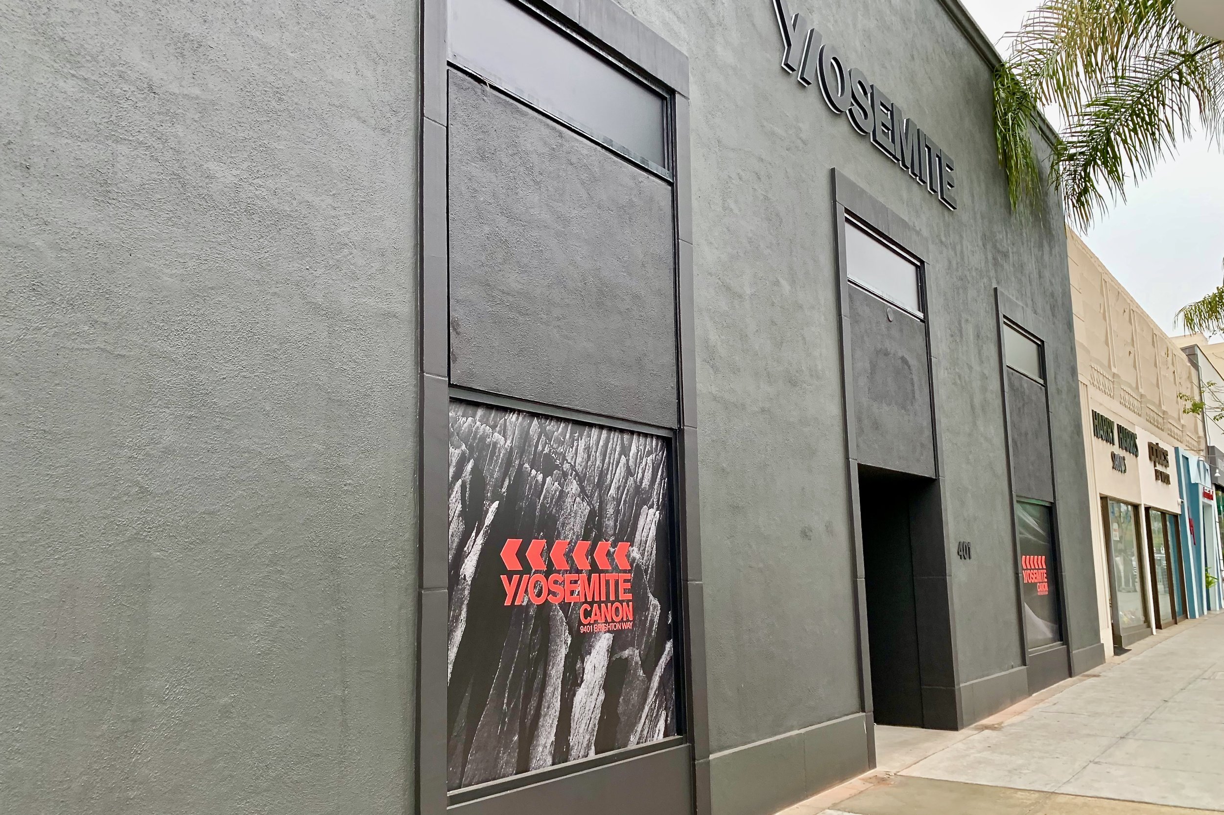
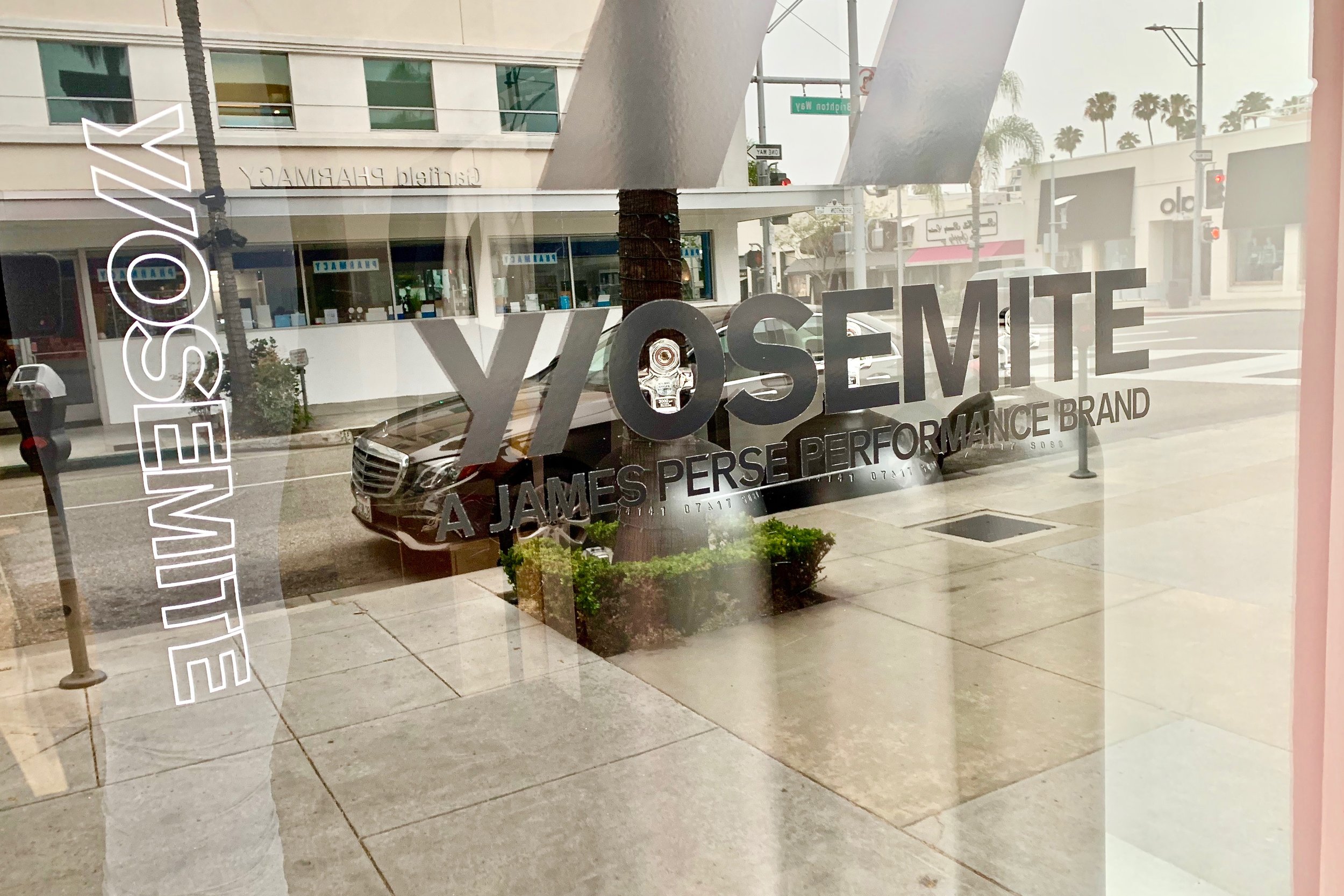
Pictured above is a new large corner store painted dark gray. Was the dark gray mimicking the granite walls of El Capitan at Yosemite National Park? Is that why the store is named Y/OSEMITE!

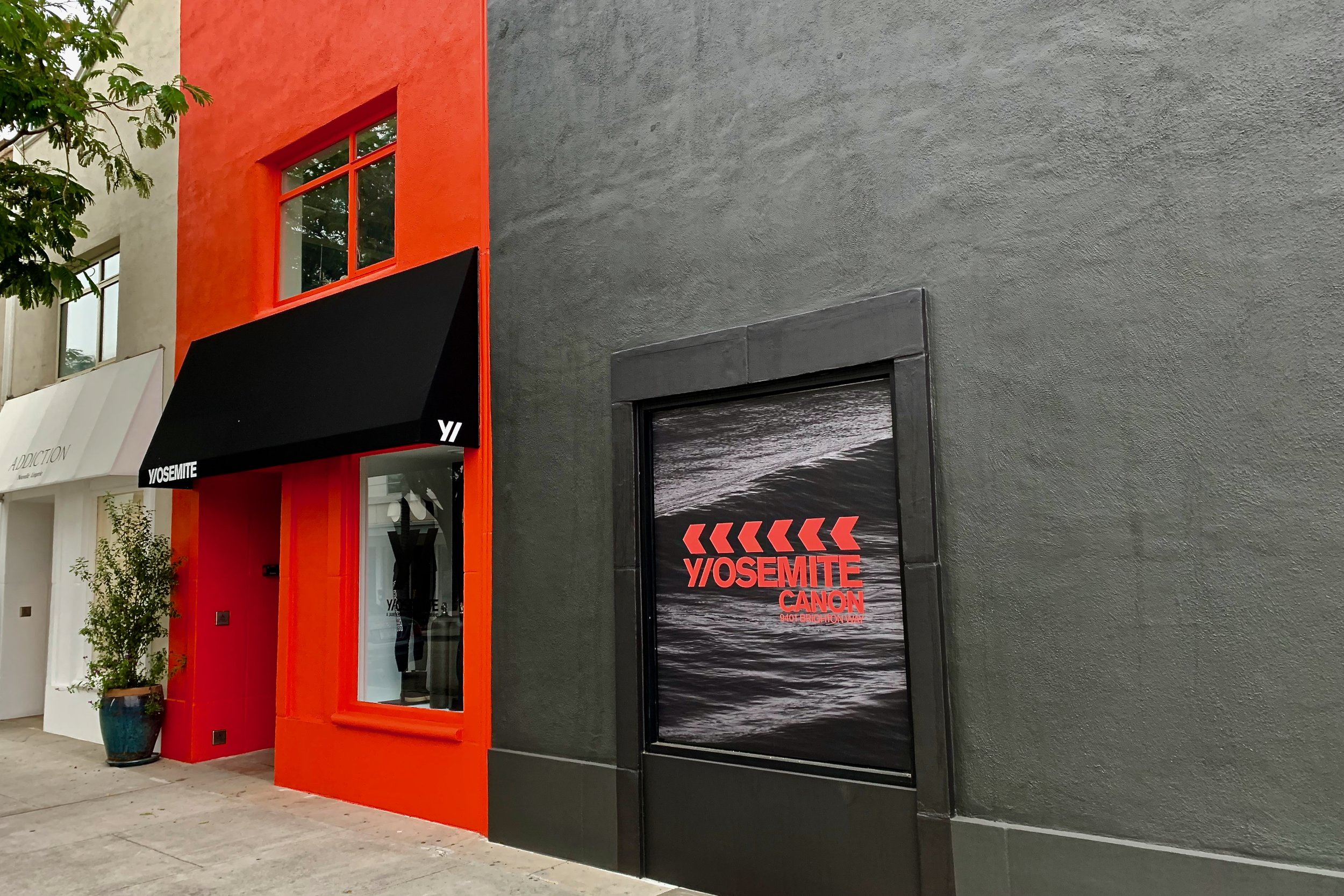
We parked on Brighton Way side to get a closer look. Here is the Brighton Way side continuation Y/OSEMITE side of the store.  The fire engine red building with the black awning reveals the answer with an actual store front and a door to come in (pictured below). Now that red could not possibly refer to our National Park.  

It was hard to read what to expect within.  Pictured below is the answer to what Y/OSEMITE is selling.

Y/OSEMITE

JAMES PERSE PERFORMANCE BRAND

Jame Perse's new performance brand is what is being sold in this store.  Or simply put this is another name for a luxury athletic clothing brand!  We solved one mystery!  And if we were not students of brands, we would have simply moved on and not given a hoot about this store.  

We knew we would be leaving Beverly Hills before the store would open, so we checked out the website.  The clothing was nice comparable to Lululemon, and AloYoga in pricing.

When it comes to clothing, we both prefer window shopping, rather than walking into the dark unknown.  Although we both are fond of the mystery genre when it comes to books and movies, this approach left us cold.  We still don't know why Yosemite was chosen as a name.  And why was the letter Y separated with a forward slash from the rest of the word?   For us, this was definitely lost in translation in Beverly Hills!

Branding Moments: Is Your Message Lost In Translation?

When it comes to branding and marketing strategy in luxury real estate, or any other real estate niche, we have always preached that your brand has to be so clearly defined that it is easy to understand and remembered by anyone in your marketplace. This fundamental aspect of branding applies, even if your potential buyers/sellers are not at the moment interested in buying or selling a home.  Branding done right needs no explanation, let alone translation.

Pictured above is a business advertisement we spotted while strolling in the small wine producing village of Gevrey-Chambertin in France (population 3084 in 2015).  There is no need to translate what this business does, and who they cater to.  

Is Your Message Lost In Translation?

Branding Moments: Are Kangaroos Cuter Than Boars?

One of the rules of brand strategy in any business especially real estate is to speak the language of your  target market.  In order to that, research comes into play.  Research takes time, and discussion in order to decide on an approach.  This leads to a branding strategy which includes a graphic, a name, a reason to exist, and be of value in the marketplace.

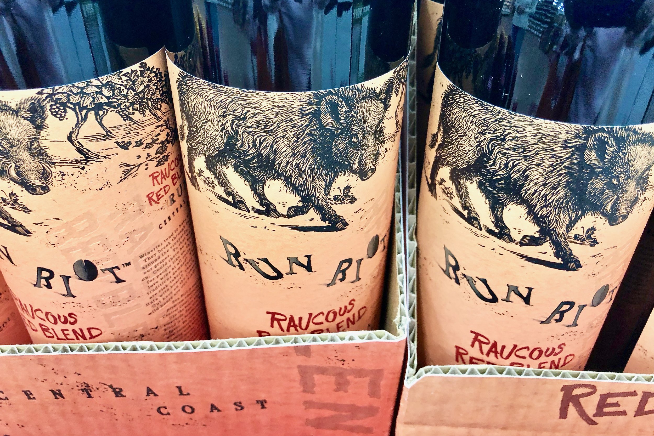
We spotted this brand of wine at Trader Joe's recently.  The etching of the boar on the label is beautiful done.  This is a red blend from the Central Coast called Raucous Red Blend.  The winery is called RunRiotWine.  Their slogan is "no rules when wine rules".  Their claim to fame is that unlike other wineries, they don't chase the boars way who roam in their vineyard.  It was initially priced between $22 to $18.  

Our knowledgeable wine friend told us, this wine is very, jammy, fruit forward, not for you.  The reviews were mostly favorable: not a very high rating and not a very low rating.  It is evident they were going for that Kangaroo wine Label (Yellow Tail) market.  This market is for those who just want a good inexpensive wine worrying about the finer points of wine making.  

Judging by the "new" price, it is evidently the brand did not attract their target market...Perhaps Kangaroos are cuter than boars to those folks. What do you think?